Collecting Tumour Autographs

Readers of this blog will have noted frequent references to The Human Genome Project — that produced the first complete sequence of human DNA — and how subsequent amazing technical advances now mean that genomes can be sequenced on an industrial scale. This has led to the Pan-Cancer Atlas, a global, collaborative effort that has analysed over 11,000 tumours of the 33 most prevalent cancers that we explained in Be amazed and No It Isn’t!

Not wishing to be left behind we need to grasp the thrust of the most recent step in this saga — a mutational signature analysis of just over 12,000 whole genome sequences of tumour matched with normal sequence from corresponding tissues. The work was done by Andrea Degasperi, Serena Nik-Zainal and colleagues at Cambridge University and they also added a couple of other studies to their analysis giving almost 19,000 sequenced cancers in total. Analysing this vast amount of data they identified single-base substitution (SBS) and double-base substitution (DBS) signatures independently in each organ.

Never mind the data!

All who keep even an occasional eye on cancer molecular biology will have a picture of what’s in this paper: an absolutely mind-blowing amount of data! So let’s put that to one side, together with the technicalities of how it was done (sorry Andrea!) and just tease out the upshot.

The analysis focussed on identifying SBSs and DBSs as signatures. A single base substitution (aka single nucleotide variant) is when one nucleotide base in DNA is changed to another (the possible substitutions are: C>A, C>G, C>T, T>A, T>C, and T>G). Double base substitutions swap two adjacent DNA base-pairs (e.g., CT:GA to AA:TT, often written as CT:GA > AA:TT).

An example of a single-base substitution signature, SBS4 (click to view axes). SBS4 is a tobacco-associated signature with a high frequency of C>A mutations occurring mainly in lung cancers (in this case a high frequency means about 90 substitutions per megabase of DNA. SBS4 occurs very rarely in other tumour types (e.g., observed in one bladder cancer, one breast cancer, one metastatic bowel cancer one astrocytoma and three central nervous system tumours) with the exception of liver to which lung tumours commonly spread (86% of liver samples carried SBS4). The y-axis is the probability of finding the mutation; the x-axis shows the 16 possible triplet sequences containing a C>A mutation. All the identified SBS signatures can be viewed together with their frequency in tumour types at: https://signal.mutationalsignatures.com/explore/study/6?mutationType=1. From Degasperi et al. 2022.

The aim was to produce a kind of family tree of each individual cancer — how damage to DNA (mutations) and the repair processes that have gone on yield a ‘mutational signature’ — a cumulative picture of how external and internal (environmental and endogenous) factors have come together to cause each cancer. And the grand idea is to show that it is realistic to determine all the key ‘driver’ mutations in an individual cancer — a critical step to the goal of ‘personalized medicine’.
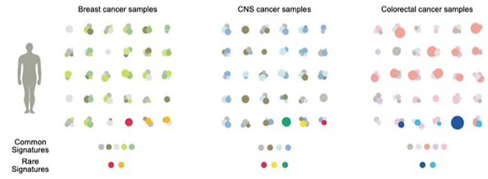
Patterns of mutational signatures in breast, central nervous system (CNS) and colorectal cancers. Common signatures are shown in gray and lighter colours. Rare signatures in red, yellow and dark and light blue. From Degasperi et al. 2022.

This study developed a new analytical package designed to fit common and rare signatures as a step to personalized therapy. The patterns revealed that each tumour sample may have different amounts of some or all of the common signatures. They may also carry a rare signature (examples in the bottom line of the figure above). Common signatures are a mixture: some occur in almost all types of tumour whilst others show restricted occurrence. Rare signatures may be unique, i.e. confined to one type of tumour, but some occur across tumour types (e.g., red dots). Collecting this type of data is important, not least because identifying the same mutation signature in tumours in different tissues will lead to treatments based on genetics — a concept that is gradually displacing the time-honoured approach of classifying cancers by tissue of origin.

Reference

Degasperi, A, Zou X, Amarante TD, Martinez-Martinez A, Koh GCC, Dias JML, Heskin L, Chmelova L, Rinaldi G, Wang VYW, Nanda AS, Bernstein A, Momen SE, Young J, Perez-Gil D, Memari Y, Badja C, Shooter S, Czarnecki J, Brown MA, Davies HR. (2022). Genomics England Research Consortium, Nik-Zainal S. Substitution mutational signatures in whole-genome-sequenced cancers in the UK population. Science 376(6591):science.abl9283. doi: 10.1126/science.abl9283. PMID: 35949260; PMCID: PMC7613262.

I Know What I Like


I guess most of us at some time or other will have stood gazing at a painting for a while before muttering ‘Wow, that’s awesome’ or words to that effect if we’re not into the modern argot. Some combination of subject, style and colour has turned our crank and left us thinking we wouldn’t mind having that on our kitchen wall.

Given the thousands of years of man’s daubing and the zillions of forms that have appeared from pre-historic cave paintings through Eastern painting, the Italian Renaissance, Impressionism, Dadaism and the rest to Pop Art, it’s amazing that everyone isn’t a fanatic for one sort or another. The sane might say the field’s given itself a bad name by passing off tins of baked beans, stuff thrown at a canvas and unmade beds as ‘art’ but, even so, it seems odd that it remains a minority obsession.

Can science help?

Science is wonderful, as we all know, but the notion that it might arouse the collective artistic lust seems fanciful. Nevertheless, unnoticed by practically everyone, our vast smorgasbord of smears has been surreptitiously joined over the last 30 years by a new form: an ever-expanding avalanche of pics created by biologists trying to pin down how animals work at the molecular level. The crucial technical development has been the application of fluorescence in the life sciences: flags that glow when you shine light on them and can be stuck on to molecules to track what goes on in cells and tissues. The pioneer of this field was Roger Tsien who died, aged 64, in 2016.

Because this has totally transformed cell biology we’ve run into lots of brilliant examples in these pages — recently in Shifting the Genetic Furniture, in Caveat Emptor and John Sulston: Biologist, Geneticist and Guardian of our Heritage and in the use of red and green tags for picking out individual types of proteins that mark mini-cells within cells in Lorenzo’s Oil for Nervous Breakdowns.

To mark the New Year this piece looks at science from a different angle by focussing not on the scientific story but on the beauty that has become a by-product of this pursuit of knowledge.

Step this way: entrance free

So let’s take a stroll through our science gallery and gaze at just a few, randomly selected works of art.

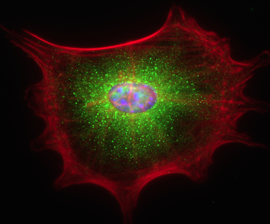
  1. Cells grown in culture:

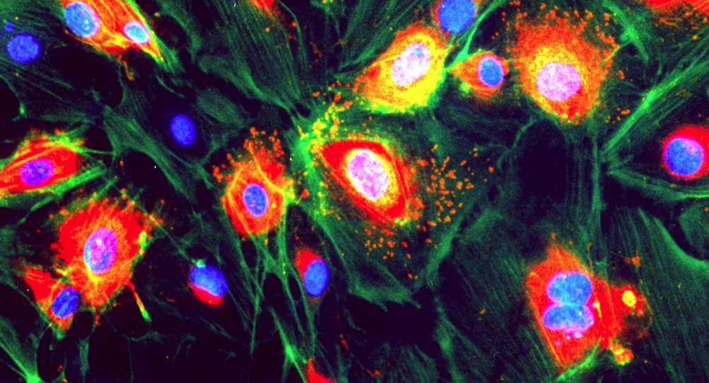
This was one of the first experiments in my laboratory using fluorescently labelled antibodies, carried out by a student, Emily Hayes, so long ago that she now has a Ph.D., a husband and two children. The cells are endothelial cells (that line blood vessels). Blue: nuclei; green: F-actin; red: Von Willebrand factor, a protein marker for endothelium.


  1. Two very recent images taken by my colleague Roderik Kortlever of a senescent mouse fibroblast and of mouse breast tissue:


3. Waves of calcium in firing neurons:

One of my fondest memories is helping to do the first experiment that measured the level of calcium within a cell, carried out with my colleague the late Roger Tsien and two other friends. I only grew the cells: Roger had designed and made the molecule, quin2. We didn’t know it at the time but Roger’s wonder molecule was the first of many intracellular ‘reporters.’ Roger shared the 2008 Nobel Prize in Chemistry for his discovery and development of the green fluorescent protein with organic chemist Osamu Shimomura and neurobiologist Martin Chalfie.

This wonderful video of a descendant of quin2 in nerve cells was made in Dr. Sakaguchi’s lab at Iowa State University.


4. Calcium wave flooding a fertilized egg: Taro Kaneuchi and colleagues at the Tokyo Metropolitan University:

Click for a time-lapse movie of an egg cell that has been artificially stimulated to show the kind of calcium change that happens at fertilization. In this time-lapse movie the calcium level reaches a maximum signal intensity after about 30 min before gradually decreasing to the basal level.


5. The restless cell (1):

This movie shows how protein filaments in cells can continuously break down and reform – called treadmilling. Visualised in HeLa cells using a green fluorescent protein that sticks to microtubules (tubular polymers made up of the protein tubulin) by HAMAMATSU PHOTONICS.


6. The restless cell (2):

This movie shows how mitochondria (organelles within the cell) are continuously changing shape and moving within the cell’s interior (cytosol). Red marks the mitochondria; green DNA within the nucleus. HAMAMATSU PHOTONICS.


7. Cell division:

Pig kidney cells undergoing mitosis. Red marks DNA (nucleus); green is tubulin: HAMAMATSU PHOTONICS.


8. DNA portrait of Sir John Sulston by Marc Quinn commissioned by the National Portrait Gallery:This image looks a bit drab in the present context but in some ways it’s the most dramatic of all. John Sulston shared the 2002 Nobel Prize in Physiology or Medicine with Sydney Brenner and Robert Horvitz for working out the cell lineage of the roundworm Caenorhabditis elegans (i.e. how it develops from a single, fertilized egg to an adult). He went on to sequence the entire DNA of C. elegans. Published in 1998, it was the first complete genome sequence of an animal — an important proof-of-principle for the Human Genome Project that followed and for which Sulston directed the British contribution at the Sanger Centre in Cambridgeshire, England. The project was completed in 2003.

The portrait shows colonies of bacteria in a jelly that, together, carry all Sulston’s DNA. This represents DNA cloning in which DNA fragments, taken up by bacteria after insertion into a circular piece of DNA (a plasmid), are multiplied to give many identical copies for sequencing.


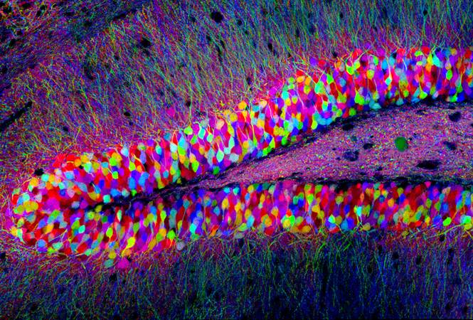
9. “Brainbow” mice by Tamily Weissman at Harvard University:

The science behind this astonishing image builds on the work of Roger Tsien. Mice are genetically engineered to carry three different fluorescent proteins corresponding to the primary colours red, yellow and blue. Within each cell recombination occurs randomly, giving rise to different colours. The principle of mixing primary colours is the same as used in colour televisions.  In this view individual neurons in the brain (specifically a layer of the hippocampus) project their dendrites into the outer layer. Other magnificent pictures can be seen in the Cell Picture Show.

It’s certainly science – but is it art?

A few years ago the Fitzwilliam Museum in Cambridge staged Vermeer’s Women, an exhibition of key works by Johannes Vermeer and over thirty other masterpieces from the Dutch ‘Golden Age’. I tried the experiment of standing in the middle of each room and picking out the one painting that, from a distance, most caught my amateur eye. Funny thing was: not one turned out to be by the eponymous star of the show! Wondrous though Vermeer’s paintings were, the ones that really took my fancy were by Pieter de Hooch, Samuel van Hoogstraten and Nicolaes Maes, guys I’d never heard of.

Which made the point that you don’t need to be a big cheese to make a splash and that in the new Dutch Republic of the 17th century, the most prosperous nation in Europe, there was enough money to keep a small army of splodgers in palettes and paint. Skillful and incredibly patient though these chaps were, they simply used the tools available to paint what they saw in the world before them — as for the most part have artists down the ages.

But hang on! Isn’t that what we’ve just been on about? Scientists applying enormous skill and patience in using the tools they’ve developed to visualize life — to image what Nature lays before them. So the only difference between the considerable army of biological scientists around the world making a new art form and the Old Masters is that the newcomers are unveiling life — as opposed to the immortalizing a rather dopy-looking aristocrat learning to play the virginal or some-such.

Controversial?

Not really. Let’s leave the last word to Roger Tsien. In our final picture there are eight bacterial colonies each expressing a different colour of fluorescent protein arranged to grow as a San Diego beach scene in a Petri dish. It became the logo of Roger’s laboratory.

John Sulston: Biologist, Geneticist and Guardian of our Heritage


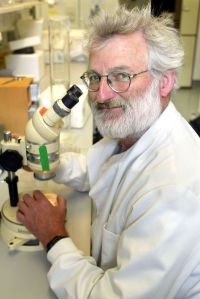
Sir John Sulston died on 6 March 2018, an event reported world-wide by the press, radio and television. Having studied in Cambridge and then worked at the Salk Institute in La Jolla, California, he joined the Laboratory of Molecular Biology in Cambridge to investigate how genes control development and behaviour, using as a ‘model organism’ the roundworm Caenorhabditis elegans. This tiny creature, 1 mm long, was appealing because it is transparent and most adult worms are made up of precisely 959 cells. Simple it may be but this worm has all the bits required for to live, feed and reproduce (i.e. a gut, a nervous system, gonads, intestine, etc.). For his incredibly painstaking efforts in mapping from fertilized egg to mature animal how one cell becomes two, two becomes four and so on to complete the first ‘cell-lineage tree’ of a multicellular organism, Sulston shared the 2002 Nobel Prize in Physiology or Medicine with Bob Horvitz and Sydney Brenner.

Sir John Sulston

It became clear to Sulston that the picture of how genes control development could not be complete without the corresponding sequence of DNA, the genetic material. The worm genome is made up of 100 million base-pairs and in 1983 Sulston set out to sequence the whole thing, in collaboration with Robert Waterston, then at the University of Washington in St. Louis. This was a huge task with the technology available but their success indicated that the much greater prize of sequencing of the human genome — ten times as much DNA as in the worm — might be attainable.

In 1992 Sulston became head of a new sequencing facility, the Sanger Centre (now the Sanger Institute), in Hinxton, Cambridgeshire that was the British component of the Human Genome Project, one of the largest international scientific operations ever undertaken. Astonishingly, the complete human genome sequence, finished to a standard of 99.99% accuracy, was published in Nature in October 2004.

As the Human Genome Project gained momentum it found itself in competition with a private venture aimed at securing the sequence of human DNA for commercial profit — i.e., the research community would be charged for access to the data. Sulston was adamant that our genome belonged to us all and with Francis Collins — then head of the US National Human Genome Research Institute — he played a key role in establishing the principle of open access to such data, preventing the patenting of genes and ensuring that the human genome was placed in the public domain.

One clear statement of this intent was that, on entering the Sanger Centre, you were met by a continuously scrolling read-out of human DNA sequence as it emerged from the sequencers.

In collaboration with Georgina Ferry, Sulston wrote The Common Thread, a compelling account of an extraordinary project that has, arguably, had a greater impact than any other scientific endeavour.

For me and my family John’s death was a heavy blow. My wife, Jane, had worked closely with him since inception of the Sanger Centre and not only had his scientific influence been immense but he had also become a staunch friend and source of wisdom. At the invitation of John’s wife Daphne, a group of friends and relatives gathered at their house after the funeral. As darkness fell we went into the garden and once again it rang to the sound of chatter and laughter from young and old as we enjoyed one of John’s favourite party pastimes — making hot-air lanterns and launching them to drift, flickering to oblivion, across the Cambridgeshire countryside. John would have loved it and it was a perfect way to remember him.

Then …

When John Sulston set out to ‘map the worm’ the tools he used could not have been more basic: a microscope — with pencil and paper to sketch what he saw as the animal developed. His hundreds of drawings tracked the choreography of the worm to its final 959 cells and showed that, along the way, 131 cells die in a precisely orchestrated programme of cell death. The photomontage and sketch below are from his 1977 paper with Bob Horvitz and give some idea of the effort involved.

Photomontage of a microscope image (top) and (lower) sketch of the worm Caenorhabditis elegans showing cell nuclei. From Sulston and Horvitz, 1977.

 … and forty years on

It so happened that within a few days of John’s death Achim Trubiroha and colleagues at the Université Libre de Bruxelles published a remarkable piece of work that is really a descendant of his pioneering studies. They mapped the development of cells from egg fertilization to maturity in a much bigger animal than John’s worms — the zebrafish. They focused on one group of cells in the early embryo (the endoderm) that develop into various organs including the thyroid. Specificially they tracked the formation of the thyroid gland that sits at the front of the neck wrapped around part of the larynx and the windpipe (trachea). The thyroid can be affected by several diseases, e.g., hyperthyroidism, and in about 5% of people the thyroid enlarges to form a goitre — usually caused by iodine deficiency. It’s essential to determine the genes and signalling pathways that control thyroid development if we are to control these conditions.

For this mapping Trubiroha’s group used the CRISPR method of gene editing to mutate or knock out specific targets and to tag cells with fluorescent labels — that we described in Re-writing the Manual of Life.

A flavor of their results is given by the two sets of fluorescent images below. These show in real time the formation of the thyroid after egg fertilization and the effect of a drug that causes thyroid enlargement.

Live imaging of transgenic zebrafish to follow thyroid development in real-time (left). Arrows mark chord-like cell clusters that form hormone-secreting follicles (arrowheads) during normal development. The right hand three images show normal development (-) and goiter formation (+) induced by a drug. From Trubiroha et al. 2018.

John would have been thrilled by this wonderful work and, with a chuckle, I suspect he’d have said something like “Gosh! If we’d had gene editing back in the 70s we’d have mapped the worm in a couple of weeks!”

References

International Human Genome Sequencing Consortium Nature 431, 931–945; 2004.

John Sulston and Georgina Ferry The Common Thread: A Story of Science, Politics, Ethics and the Human Genome (Bantam Press, 2002).

Sulston, J.E. and Horvitz, H.R. (1977). Post-embryonic Cell Lineages of the Nematode, Caenorhabitis elegans. Development Biology 56, 110-156.

Trubiroha, A. et al. (2018). A Rapid CRISPR/Cas-based Mutagenesis Assay in Zebrafish for Identification of Genes Involved in Thyroid Morphogenesis and Function. Scientific Reports 8, Article number: 5647.

Slip-Slop-Slap Is Not Enough

I’ve always credited Richie Benaud, the wonderful Australian cricketer and commentator, with the Slip-Slop-Slap slogan (I know – it was really thought up by some bright spark in Cancer Council Victoria who got Sid Seagull to sing it). But Mr. B ingrained it into cricket lovers world-wide as a mantra for preventing them getting skin cancer (slip on long sleeved clothing, slop on sunscreen and slap on a hat, you see) – the main preventable cause of melanoma being excessive exposure to ultraviolet (u.v.) radiation, most of which comes from the sun. And maybe it worked for the cricket fraternity who are, by definition, very smart cookies. Unfortunately in Australia the number of new cases of melanoma – the most lethal form of skin cancer – goes on increasing (over 11,000 in 2008) and it’s a serious UK problem too with 13,000 new cases in 2012 (the second most common cancer in 15 to 35 year olds) and over 2,200 deaths.


Avoid sunburn …                     Play cricket …                     … for Cambridge!!

Finding a major melanoma mutation

In 2003 sequencing of the human genome was completed and it wasn’t long before Mike Stratton and his colleagues at The Sanger Centre near Cambridge had applied the knowledge and methods of that great triumph to melanoma – a form of cancer about which virtually nothing was known in terms of its molecular biology. They made the remarkable finding that a mutation in a gene called BRAF switched on a signal pathway that drove cell proliferation in about two-thirds of melanomas. Remarkable because that gene had not previously been associated with any cancer. Even more amazingly, within a few years drugs had been developed that targeted BRAF and caused substantial regression of tumours that had spread (metastasized) in patients.

Like all cancers, melanoma is not caused by one mutation and other ‘drivers’ have since been identified – which was a bit of a relief because a perplexing thing about BRAF is that the mutation that turns it on is not the kind of genetic change caused by u.v. radiation. So the link between radiation, BRAF and melanoma is explained in most cases by u.v. exposure damaging a variety of genes which then act together with mutant BRAF to promote the disease.

Black, red & white mice

A different complexion

Clear so far? Good – but you will know that cricket and cancer have in common the fact that they are both a deal more complicated than they appear to the uninitiated. The first quirk of melanoma is that folk of fair complexion or with red hair or freckles are more at risk. The wide variation in human colouration is controlled by two forms of a pigment called melanin (pheomelanin and eumelanin). A key regulator of the balance between the two is a signalling system – a messenger talks to its receptor on the cell surface telling the cell to make more eumelanin. Upset this system and the balance is disturbed – you get redder because you make relatively more pheomelanin.

Mouse models

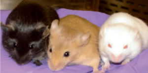
It’s possible to make a mouse model of human redheads (you shouldn’t be surprised: remember mice have more or less the same number of genes as us, including one that makes the receptor that controls redness). So some bright sparks in the US of A have done just that by mutating the mouse receptor – with interesting results. When the ‘red’ mice were bred with animals carrying the mutated BRAF gene associated with melanoma in humans, many develop exactly the same type of cancer – whereas black mice (lots of eumelanin) and white mice (who can make neither of the pigments) have very low rates of melanoma. And, of course, it was important in these experiments that the mice weren’t allowed to nip off to sunbathe and watch cricket – i.e. they were kept in a u.v.-free environment.

What this shows is that red mice (and by extension, their human counterparts) can get melanoma by some means that doesn’t involve u.v. It may be that eumelanin protects DNA from two forms of assault: it not only absorbs sunlight but also limits the effect of chemicals produced within the body that can mutilate our DNA.

Whatever the mechanism, Richie is right as usual: we should continue to Slip-Slop-Slap because too much catching the rays can cause melanoma – especially in fair, freckled red-heads. But that isn’t the full story and the imperfections of our bodies mean that we can develop this cancer from within as well as without.

Reference

Mitra, D., Luo, X., Morgan, A., Wang, J., Hoang, M.P. (2012). An ultraviolet-radiation-independent pathway to melanoma carcinogenesis in the red hair/fair skin background. Nature 491, 449–453.

http://www.nature.com/nature/journal/v491/n7424/full/nature11624.html